|
Written by: Jackly Ly (Publicity Commissioner) This is for those people who don’t have photoshop, or want to make flyers with your own hands on the screen. For this article I will be covering the basics on how to make a background and all of the tools that are available. I will show you the following: Color, Brushes, Gaussian Blur, Liquify, Perfect Shapes + Lines, and most important: Text. 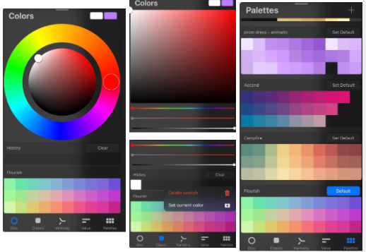 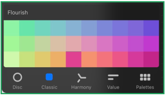 1 . Color Going to the top right you will see a color wheel. You can change it into a square if you prefer so it’s easier to pick a specific shade. You can create palettes by tapping the palette to default and tapping with the color you've selected into the palette. If you want to delete a color just press and hold until the delete button appears. You can also drag a color from the palette anywhere in the palette if you want. The palette can hold up to 30 colors. If you had black and then got white, but you wanna switch back. Hold the colored circle (top right) and then it'll go back to the previous color. You also can press and hold the screen and select the color. You can go to your history and go back to the past 10 colors you used. 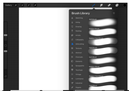 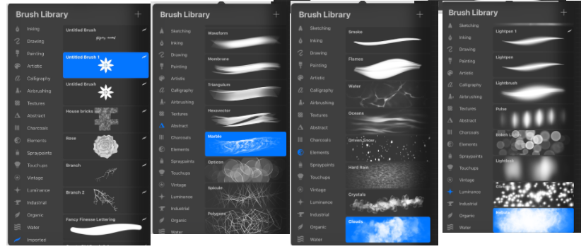 2. Brushes By pressing the brush tool near the top part of the screen there will be a lot of brushes. There are a lot of categories and brushes in them. You can also duplicate them and edit the brushes. Many of these could help and give that nice touch or aesthetic. While some are questionable, weird and not as helpful, but it is what it is, it's 2020 and we’re quirky. You can also change the brush size/opacity on the far left of your screen. The top rectangle is changing the size of your brush, the middle square is drop and select color and at the very bottom is your brush's opacity. Underneath all of that there is also an undo and redo button or you can tap two fingers to undo and three for redo. You can also import brushes if some of these aren’t the perfect one for your flyer making process. By the way, your eraser can also do the same which is next to the hand button. 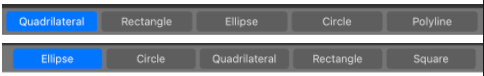 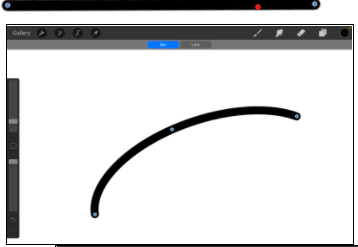  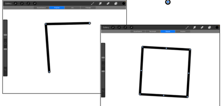 3. Perfect Shapes + Lines To create a perfect line, draw a line and hold it. It’ll turn straight and it’ll say “Line created” on the top. Once you let go it’ll now say “Edit shape” press on it and you have options depending on the line you drew/how it’s detected. There’s Line, Arc, Polyline, Ellipse, and Quadrilateral. If you want the line to be longer, there's two dots on each end, you can drag the dot to anywhere you want to make. Just a tip if you draw a small line and you want to make it longer it’ll look like a bunch of dots in a line, sometimes there’s space in between those dots so I wouldn't recommend it. Unless that's what you were going for anyways. In order to get the option Arc you'll need to draw something like a parentheses. The Arc gives you two edits on both ends of the line as well as the center. The Polyline is available once you draw the line with an angle and you have the ability same with the Arc. The Quadrilateral would work best if you draw a shape. Drawing a Circle and holding down, you can edit any four dots and make it an oval. If you want the Circle bigger you have to hold the Circle but not the dot and drag it outwards. The ellipse for that is just an ‘imperfect’/in symmetrical Circle. There’s also a Quadrilateral and rectangle which just changes the Circle into a Quadrilateral. You can select each option if you want and you can drag it anywhere on the canvas as long as you don't tap the screen. Tapping the screen will set it to be its final form. If you're drawing a square picking the option square, you’ll have the same options as drawing a Circle and picking a Circle. Same goes for a triangle as well. A Quadrilateral will give you a choice to move any corner of it to anywhere. If you wanna draw other shapes that are a pentagram, hexagon, etc then you have to draw, hold and pick Polyline and draw the corners where you want them to be. That is it for this section. 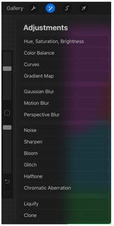 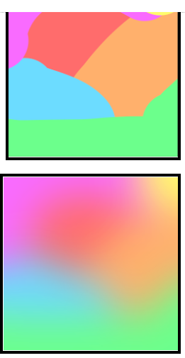 4. Gaussian Blur Gaussian Blur is a tool that you’ll probably use a lot if you don’t want to use a solid color, or you have a lot of colors that need to be a bit fused together a bit. After coloring and wanting to blur this you press the magic wand button (the one after the wrench on top left). There will be a lot of options but look for options but click “Gaussian Blur”. Once you select it, you can drag your finger or pencil towards the right of the screen. You can drag all the way to 100% or however looks best. When you’re done you can press almost any button at top and it’ll stop. 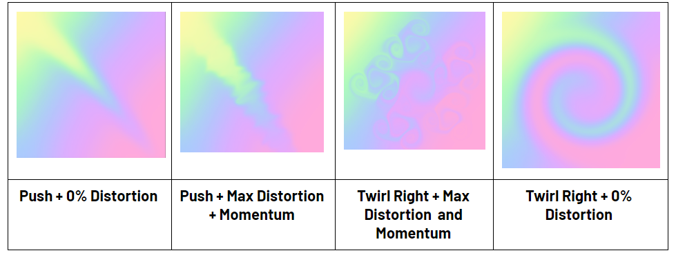 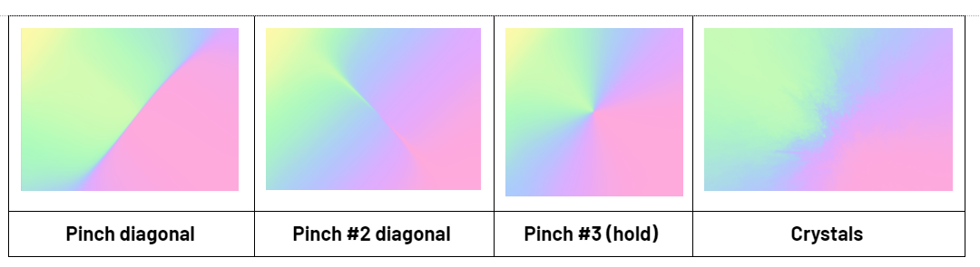 5. Liquify Going back to the magic wand button, go down to where it says Liquify. there will be a bunch of modes that you can use. There’s Push, Twirl Right, Twirl Left, Pinch, Expand, Crystals Edge, Reconstruct Adjust, and Reset. I won’t show, Reconstruct, or Reset because they just put everything back how it used to be before you used Liquify. There’s also “Distortion” and/or “Momentum” which is a bit of a game changer and can make the Liquify effect look nicer. Distortion adds more life and Momentum kind of continues the Liquify brush a bit after wards. With no Momentum it just ends immediately after you let go. 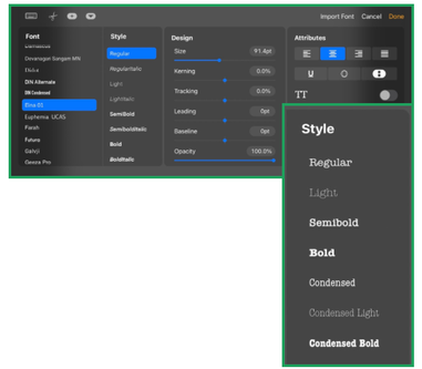 6. Text Text, the most important part of flyers. In order to text something into the canvas you have to click the wrench button (next to the magic wand) and go to add, there is an option to “Add Text”. In order to change the font or change anything is to press the “Aa”. There are the following options: Font, Style, Design, and Attributes. Font obviously is just to change the font. Style depends on the font, there can be Regular, RegularItalic, Light, LightItalic, SemiBold, SemiBoldItalic, Bold, BoldItalic. There is a lot more listed. Some fonts either have 1-5 ‘Style’ or some may have more up to 8-10. There are 84 fonts automatically put in and of course you can download fonts and import them like brushes. Design: there's Size, Kerning, Tracking, Leading, Baseline, and Opacity. Kerning and Tracking basically do the same thing. Kerning and Tracking creates space between each letter. Size changes how big or small the text is. Baseline separates in between each line of words like how there’s double space on google docs but either really separated, right underneath, or mashed up with the words above. Opacity makes it how much the words are seen either visible to invisible. Attributes: the four buttons do the same if you're using a google doc or instagram, etc. U just gives it an underline, and the O hallows the inner parts of the letters. The second to last one makes the text go vertical, so you read up to down. TT capitalized/uppercase all letters. If you wanna change the text you wanna highlight the part you wanna change. If you are done and after you wanna change the text you want to press on the text or go to the top right where there are squares. Tap the text layer and pick “Edit Text”. If you wanna change the color of the text, edit the text and highlight, and press very top right and you get to choose any color. 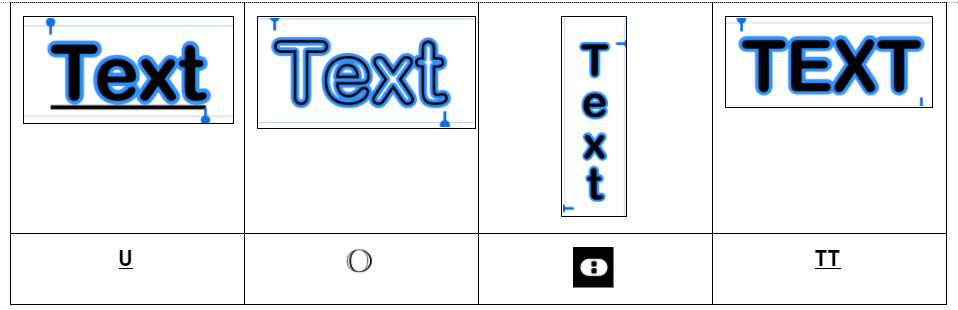 Tip: If you want to make the text stand out more from the background you wanna Layers. Swipe the Text layer to the left and press duplicate. Tap on the bottom Text layer and choose “Rasterize Text". Before you do this you wanna change the color of the text and press layers, tap on the specific layer and press select, choose the brush and select the color from top right and just brush your finger over it. When you’re done all you have to do is just do the Gaussian Blur. Duplicated if needed. 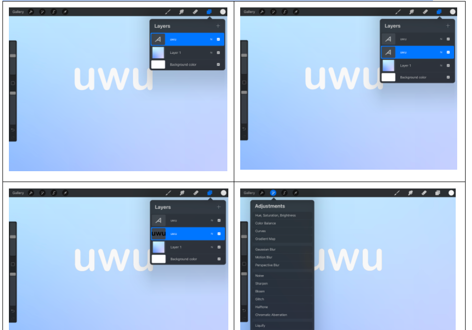 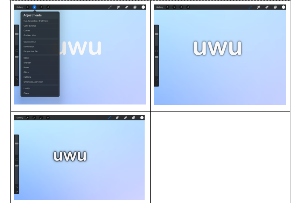 |
AuthorPublicity Archives
December 2020
Categories |
 RSS Feed
